Taxi TechBlog 1: Data Prep and Backend
A week ago, I published NYC Taxis: A Day in the Life and it went a little bit viral. This seems to be the perfect mix of some brand new (for me) techniques that were a huge hit, along with subject matter that seemingly everyone can relate to. This is part 1 of 2 of a techblog about how I built this visualization, and will cover data munging and building the backend. The next post will talk about the frontend, including animations and charts.
My code is open source and available on github.
Viral Notes
But first, a few words about the launch and reception. The visualization was published in the early hours of Monday, July 14th, after I spent just about the whole day Sunday putting finishing touches on it and getting it to run on Heroku. I’d been working on it for over a month, sneaking in a few hours here and there on nights and weekends, and just wanted to get a minimum viable product launched so I could stop thinking about it (that backfired :p ). By Monday evening it had seen over 80,000 unique visitors, had around 900 to 1000 concurrent users, and had racked up a whopping 600,000 map views on Mapbox. It was picked up by FiveThirtyEight, The New York Times, Technically Brooklyn, Gizmodo, The New York Observer, Gothamist, TechPresident, Fast Company, Bloomberg, The Washington Post, Huffington Post, AM New York, New York Magazine, Quartz, Bustle, mashable, and, most unexpectedly (but so awesome), BuzzFeed. It even got coverage in the UK, The Netherlands and France.
On Monday afternoon, someone from Heroku (where the app is hosted) noticed the spike in traffic and the subsequent failed page loads, and contacted me to recommend turning on more dynos (I am not very experienced with heroku and had no idea what that meant, but it literally came down to dragging a slider, and the traffic became much more manageable.) Heroku also generously added me to their beta program to help cover the costs of the additional dynos.
Concerned about almost $1000 in overages on my Mapbox account in the first 12 hours, I took to the twittersphere asking the civic hacker community for some advice on how to deal with the situation. Monetize with ads? Add a paypal donate button? Switch to Open Street Maps’ free tile solutions? The chatter caught the attention of Mapbox, who got in touch with me within an hour and offered to sponsor the app! (I had already switched out the mapbox maps and put up a OSM tileset, but not having a dark, subdued basemap was suboptimal for the visualization. In any case, OSM rules and deserves a shoutout for making hosted, leaflet-compatible tiles available for the world to use)

Read the very long string of responses here. Mapbox stepped in offered to help!
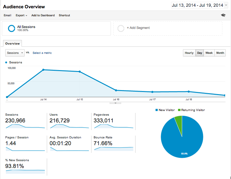
At the time of this posting, the visualization has been shared over 4700 times on Facebook, 3700 times on Twitter, had 300,000 pageviews from 216,000 visitors.
Querying the Data
I’d FOILed the 2013 taxi trip data a few months ago. The blog post I wrote about it had gotten some attention, and resulted in dozens of requests to share the data. Many people came to the BetaNYC hacknights, hard disk in hand, to transfer the data on the spot. About a month ago, some of the requesters urged me enough to create a couple of torrents. At the same time, Andrés Moroy (someone I don’t know except via twitter) offered to host it so I finally got all 50GB zipped and uploaded.
Over the next couple of weeks, data scientists all over the world started publishing lots of interesting analyses of the data, and after someone loaded the data into Google BigQuery, a rather interesting thread erupted where people were showing off all sorts of ways to slice up the 173 Million Rows quickly. This would prove to remove a huge barrier to entry for me.
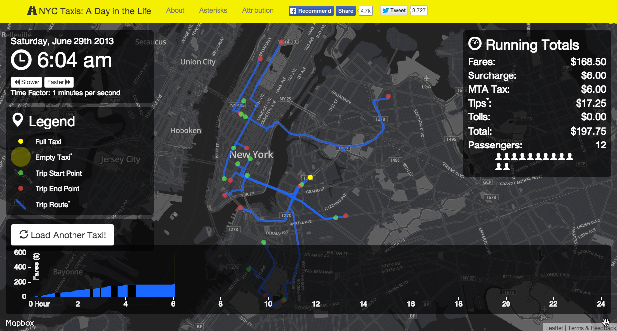
I’m not sure when the idea of “a day in the life” of a taxi came to mind, but it came directly from the simple question: “How much does a single taxi/driver earn in a single day/shift?” I’d heard that many drivers rent their shifts and need to earn back enough to break even before they take anything home. I’ve done similar static “Day in the life” map projects using the twitter API as well. Because the time and start/end location of each taxi trip was available, it just made sense to follow along to see when/how/where they earned their money over the course of he day.
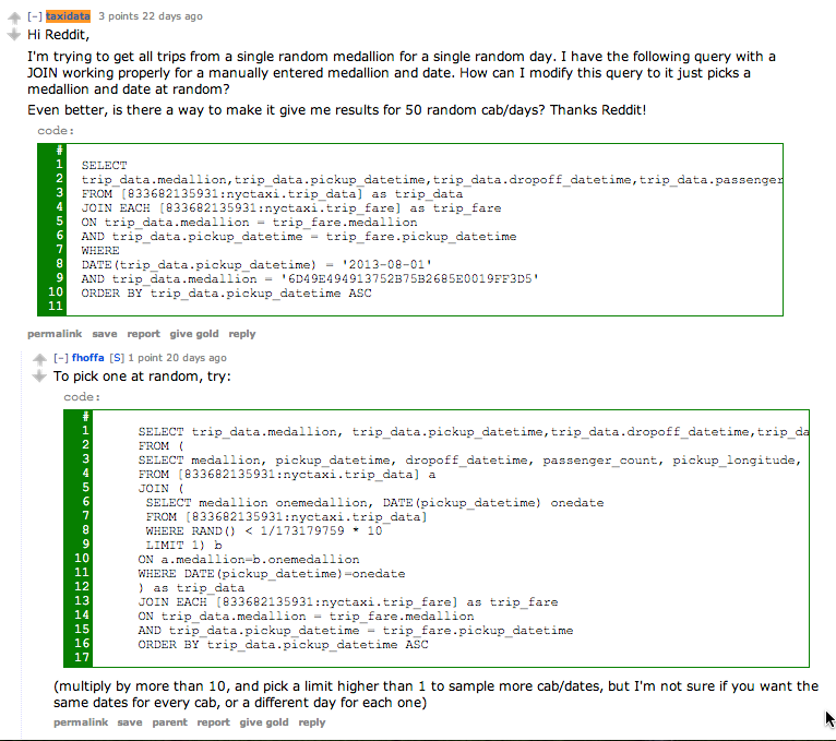
I set out trying to figure out how to use BigQuery to get the data I wanted: A full day’s trips for a single medallion. With a hard-coded medallion and date, I was able to slap together a query that worked, but I had no idea how to pull all trips from a random cab on a random date, let alone man random cab/days. Reddit to the rescue! u/fhoffa, who started the Taxi Data BigQuery thread, helped me out in an hour with the exact query I needed:
The combination of having the data in BigQuery and a rather awesome community on Reddit already working on the data probably saved dozens of hours if I had tried to do all of this on my own. I can’t stress enough how important the community is to civic hacking projects like this.
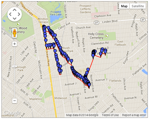
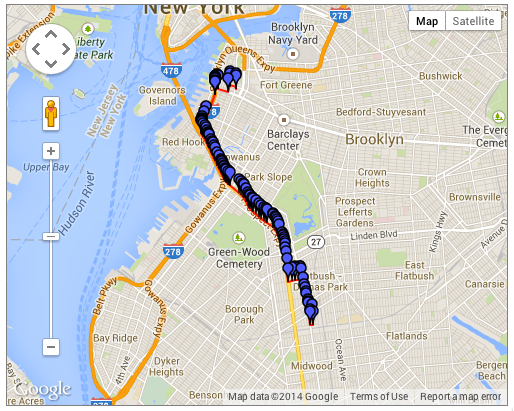
So, data in hand, I see that there are around 30-60 trips a day for most of these vehicles. We have a time succession of geographic points, which is enough to string together into a line. This can be animated, as I’ve done in this animation of twitter user’s movements, simply moving a dot “as the crow flies” between the start and end points, and keeping accurate time with an accelerated clock. However, simply moving a dot between start and end points wasn’t going to cut it for this visualization. I wanted to show something that resembles a car actually driving, so I needed a way to trace out a reasonable driving path for each trip. Enter the Google Directions API.
BetaNYC recently had a series of events around the newly released Citibike Trip Data, which also includes only the start and end point/time for each trip. I’d heard several civic hackers profess the awesomeness of the API for inferring a possible route from a trip’s available data. Googling will get you to their documentation page, which has pretty much everything you need.
I built a few API calls between random spots in New York to see what kind of results I would be dealing with:
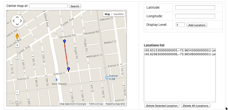
https://maps.googleapis.com/maps/api/directions/json?origin=40.631538,-73.965327&destination=40.691099,-73.991785&key={myKey}
gets us JSON:
{
   "routes" : [
      {
         "bounds" : {
            "northeast" : {
               "lat" : 40.692154,
               "lng" : -73.96506359999999
            },
            "southwest" : {
               "lat" : 40.6295283,
               "lng" : -74.0034151
            }
         },
         "copyrights" : "Map data ©2014 Google",
         "legs" : [
            {
               "distance" : {
                  "text" : "5.8 mi",
                  "value" : 9352
               },
               "duration" : {
                  "text" : "14 mins",
                  "value" : 850
               },
               "end_address" : "90 Court Street, Brooklyn, NY 11201, USA",
               "end_location" : {
                  "lat" : 40.6910763,
                  "lng" : -73.9917049
               },
               "start_address" : "716-722 Westminster Road, Brooklyn, NY 11230, USA",
               "start_location" : {
                  "lat" : 40.6315269,
                  "lng" : -73.9654273
               },
               "steps" : [
                  {
                     "distance" : {
                        "text" : "0.1 mi",
                        "value" : 213
                     },
                     "duration" : {
                        "text" : "1 min",
                        "value" : 26
                     },
                     "end_location" : {
                        "lat" : 40.6296317,
                        "lng" : -73.96506359999999
                     },
                     "html_instructions" : "Head \u003cb\u003esouth\u003c/b\u003e on \u003cb\u003eWestminster Rd\u003c/b\u003e toward \u003cb\u003eAvenue H\u003c/b\u003e",
                     "polyline" : {
                        "points" : "az~vF|jmbMzJiA"
                     },
                     "start_location" : {
                        "lat" : 40.6315269,
                        "lng" : -73.9654273
                     },
                     "travel_mode" : "DRIVING"
                  },
The route is our overall trip, which is divided into legs. This API call included only an origin and destination, so there’s only 1 leg. If we had added waypoints to our API call, we could have up to 9 legs returned.
Each leg has steps, which are basically chunks of the trip that don’t require some instruction to the driver, such as turning or merging onto a highway. Each step has its own html_instructions that are the same thing Google would show you for turn instructions if you got directions via google maps. Neato.
But wait, how does this help us map the step/leg/route? Here’s where it gets interesting. Each step includes a polyline, which looks like this:
"polyline" : {
                        "points" : "az~vF|jmbMzJiA"
                     }
What the heck does az~vF|jmbMzJiA mean? It turns out that this is google’s super-compressed format for encoding polylines. This string can be decoded into a series of latitude/longitude coordinates representing the path to be followed for this step! There’s a handy widget for decoding/encoding these and mapping them on the fly here. Give it a try. Copy az~vF|jmbMzJiA and paste it in, see what you get.
Further down in the JSON response from our API call, there’s an overview_polyline that shows the entire route strung together:
"overview_polyline" : {
            "points" : "az~vF|jmbMzJiAR~DgBPuJ~AEN[FyBb@_I|A}AV}Dz@yDr@_JfBuMfC}Bb@F|@^bHDHTjEXdG}MxAcJbAqEj@aFd@iBR}BXmBXmA\\kA`@aA^{KfFyD`BuAr@}AfAmAjAoAzAm@x@gFvJk@dAaAtByBdE_BzCyBhEoCnFy@lAiArAkAhAiBlAoEtCoDbCsApAkA|AcBvCiJ~QgAjBMj@}@hBo@|@s@v@sAdA_@PmBr@eBt@i@VwAnAsDtBaE|B_FjCyBlA_DzAi@XoBdAiGhDK@YJ_A\\iBx@yBrAuBvAkBvAgBzAUN[LYF]B[CWEqBq@kFuBgHoCkf@{Qk@Om@IeACY@OB_@G_@A[EQCc@[KWKc@He@F[@g@rDgScG{B{B{@jBoKhBr@"
         }
Go ahead, try that one in the decoder widget too. You’ll see that the results don’t seem to make sense, as the polyline starts on the roads and then wanders off in seemingly wild directions. This is because there are escape characters in the encoded string. Look above, every place you see “\\” is really meant to represent a single backslash. Try the encoder tool again, you should see a more sensible path.
With escape characters:
Without escape characters:
Now I needed a way to decode and encode these programatically. Google has a Geometry Library that you can use to decode these client-side, but I had plans to decode these server-side and convert them to geoJSON. Some googling led me to MapBox, who has released a kick-ass open source Node Package that encodes and decodes these google polylines! How cool is that?
The Plan
Now, all of the pieces are in order…
- Use BigQuery to get a bunch of random trip/days Download them as a CSV
- Write a node script to build out API calls for each series of 4 trips (Each API call can handle and origin/destination and up to 8 waypoints, meaning 9 total legs per call. Each taxi trip consists of two legs, the trip itself and the “downtime” between this trip and the next trip. So, we can efficiently handle 4 trips/8 legs per API call)
- Append the polylines to the raw data, also append the start time of the next trip as a value for the current trip (so we know how long the “downtime” lasts)
- Move everything into a sqlite database
- Build a node server with a single endpoint, /trip, that will query the sqlite db for all trips for a random medallion, convert the results to geoJSON, and send the response to the browser.
getDirections.js opens our bigQuery results CSV, builds out API calls, and appends the appropriate polylines to the raw data. You can check out the code in my github repo. I won’t go into too much detail here, but I basically slice the number of trips for each taxi into groups of 4 or less, use the start point of the first trip as my origin, and the start point of the next group of 4 or the last stretch of downtime as my destination. The rest of the start and end points are waypoints. Once everything is stored in the appropriate strings/arrays, I build out my API call like this:
var fullApiCall = apiBase + origin + destination + waypointStr + apiKeyStr;
I store all of the fullApiCall strings in an Array that I use later to actually make the calls and process the results.
There’s also a step to combine all of the polylines for the steps into a large polyline for each trip or downtime. This is done using the Mapbox package I talked about before, getting the encoded latitude and longitude coordinates, linking all of the steps together for a single trip, and then re-encoding them.
function getPolyline(leg){ //gets steps for leg, combines into one polyline
var legPoints = [];
  for(s in leg.steps){
    var points = leg.steps[s].polyline.points;
    points = polyline.decode(points);
    for(p in points){
     legPoints.push(points[p]);
    }
  }
  legPolyline = polyline.encode(legPoints);
  return legPolyline;
}
The raw data:
medallion,pickuptime,dropofftime,passengers,pickupx,pickupy,dropoffx,dropoffy,fare,paymenttype,surcharge,mtatax,tip,tolls,total
8139A6C9596767B37F84DACB7E200BDD,2/11/13 0:02,2/11/13 0:27,6,-73.863464,40.769997,-73.981827,40.772884,34,CRD,0.5,0.5,6.9,4.8,46.7
becomes:
medallion,pickuptime,dropofftime,passengers,pickupx,pickupy,dropoffx,dropoffy,fare,paymenttype,surcharge,mtatax,tip,tolls,total,nextpickuptime,key,trippolyline,nextpolyline
8139A6C9596767B37F84DACB7E200BDD,2/11/13 0:02,2/11/13 0:27,6,-73.863464,40.769997,-73.981827,40.772884,34,CRD,0.5,0.5,6.9,4.8,46.7,2/11/13 0:30,0,azywFtpyaMGFGHsGhK??AD?HAF?H?F?H?F?F@H@F@DBBBDJLBDPR`@d@??RNFDDDDBF@D@D@D?DADADABCDEDEFMd@m@j@iAjA_CHQ??REB?B?B?@?B@FDBB@@@D@D@D?F?D?DANCHCNEJEJILIJIPILEFCDCFEV??o@dAaAbBi@dAu@rA]v@[p@c@hASj@_@lA[jAQx@Y|AKp@Ip@I|@I|@Ev@Gr@Cp@KhACRE|@Ev@Av@??HT@F@LBN@NBPBNDPLn@H`@DVFb@?DBD@BBDDHJbADXBXPlAHf@Hf@\|ARt@Nh@Nj@^jAZz@`AdCtBnEvBzE`A~BNZf@tAt@vBpAdEb@~Ap@vCf@~Bb@`CTrAF\?@?@FV?B?@VbBFd@TdBRnBPlBDp@Dj@HzAB\@V?XBb@@f@?X?~@Ap@Al@ElAGfAI~@?@QjBEf@c@rFAF[jD[fE]|E}@rJYxDE\?@?B?@}@vJK~@?@MfA?BAB?FA?APAD?@Ef@_@rB_@vBi@vC??Gn@KnAOfBEhAEvASzA[vBO|AGf@Cj@Gx@AXIjCE|@E`@Gv@ANGz@Ch@WhCW|CAHY~CUjCEVG^Mn@Kb@O^Yl@Yf@CDYb@m@x@qAlBSZw@pAiAbBMRMREHA@QVk@z@KPW^?@A?aBdCCBs@hA_@h@ILUV_AhASPCDw@t@}AhAa@XoAz@}BzAkAz@oHdFGDYRGDCBYRiNrJYRKHA@ID}HzFw@j@w@h@u@b@YLe@Pi@LWF_@DYBa@Bq@?E?e@Cc@EmAUm@Ug@SCAe@YYSOM_Aw@y@w@uAiAq@k@[WCCKIII}@w@mA{@aBwASOSQkB_Ba@c@c@_@wAqAaCsBaGaF???[?AAAUU]_@KKY]a@c@i@o@IKOQACoAwAm@q@oAuA{BeC}@aAACw@aAs@{@GGGGIGICCCECMEKAOEKAM?K?M@MBKBKDKHKJILILENELALANAP?P?P?RAP?NCRATCREXCTEVEVI\GTOn@WzA??e@hAu@nBKVKXQb@GNGPUp@Qd@Qh@Ql@Y~@GTABCHo@|BADKZIVIVa@rAaFxO??IDA@A@OVQTSTQTIJKPA@ABELM`@Qd@ENCFITIZITGRCFITK\{A|E??A@ABADITGLGJGFEDEBC@E@C@G@K?YAKCOG??M`@??PHt@d@`@VZRVPjBpALHHDfBnAz@h@dAp@zB|Az@h@~@l@lAv@n@b@lAv@l@b@dAr@x@h@x@h@jAt@fAt@bAl@rBvAjAv@t@f@lAt@l@`@~B|AjAx@p@`@|B~AdAp@z@h@tDdChAr@??}D~LeC`IyAnEa@tAWr@oA|Dm@jBGLCHa@nA{AvE??jCbB^VXPBB~@l@lAx@l@`@rBrAHF|BxAfC~AxBvAxB|AnAx@j@`@??gAdD}@nCg@zAGPABIX_AxCUt@Ml@Kj@Gb@Ej@Gd@Mr@Md@Qh@Sb@Ub@U^_@l@]r@Yn@Uj@Wr@W|@IZENGTETEFABCHG\EXCRENCLGNEHIJQTIJKX[|@??mFxP??dAp@`Ap@tA|@p@b@zBzA~BzAzBzA`CvAzBxA|BzA|BxAzBdBl@b@vA~@fC`B|@j@`Al@|B~Aj@^VPx@h@d@XZNdAl@xBvAfCbBfCbBr@f@dAr@bCzA~B|A|BzA|BzAhCdBfC`BzB~AzBtA~BzAxB|A|BxAfAr@v@f@??Nk@,qmzwFjqpbMzEiO??|BxAnBrAJFz@j@FBz@f@??{BbHUl@aBhF??~BtAf@^
Importing a csv to sqlite can be done at the command line, and I won’t go into it too much here.
Next we build a node server. When someone hits nyctaxi.herokuapp.com/trip, pick a medallion at random:
 var getMedallion = "select medallion from `trips` order by random() limit 1";
db.each(getMedallion, function(err, result)
Then, get all of the rows that match that randomly chosen medallion:
function getRows(medallion,callback) {
 var statement = "select * from 'trips' where medallion = '" + medallion + "'";

 summary = [];

 db.serialize(function() {
 db.each(statement, function(err, result) {
 if (err) { console.log(err); }

 summary.push(result);
 },function(){
 console.log(summary.length + " rows found for this medallion");
 callback(summary);
 });
 });


}
Next a function called createGeojson() decodes the polyline for each trip and downtime, and creates a properly formatted geoJSON LineString. These are pushed to a featureCollection, and that featureCollection is sent back to the browser as a response.
So, hitting /trip gets us a geoJSON FeatureCollection for an entire day’s trips for a single medallion, ready for immediate visualization using D3’s d3.json() function!
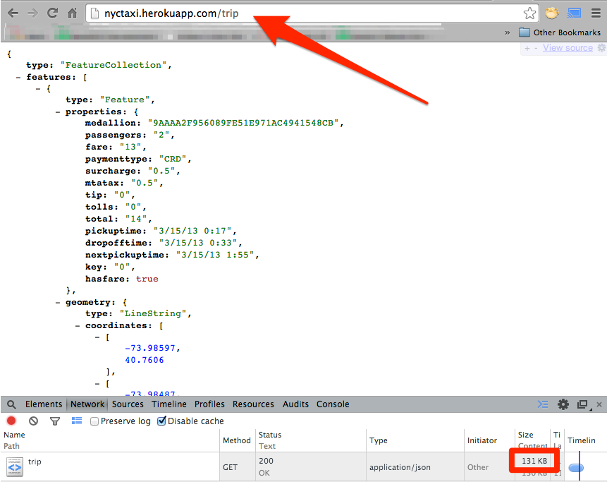
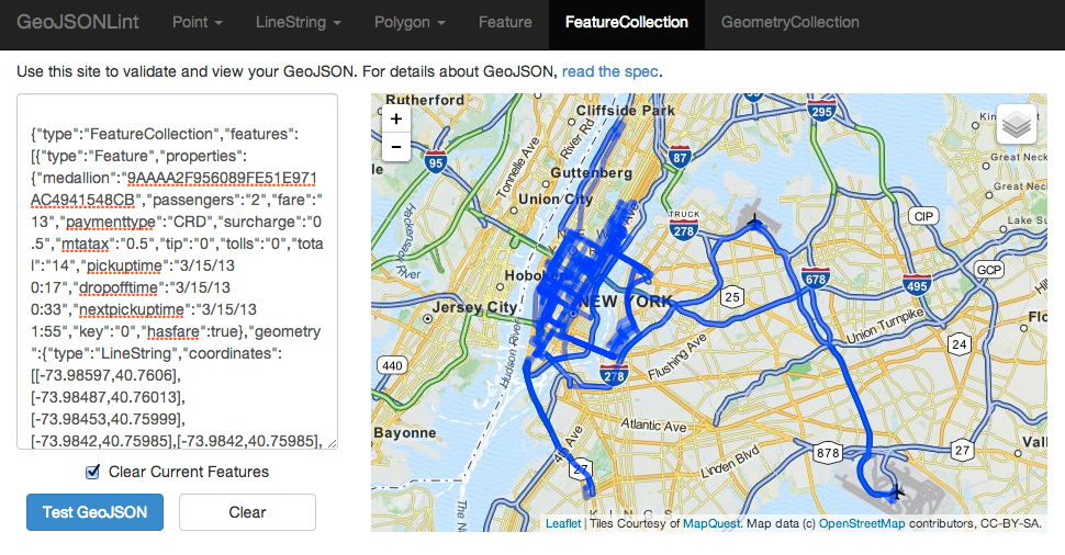
It weighs in at 131kb for this trip. It would have been more efficient to decode the polylines client-side, but I really wanted to just have geoJSON ready to go for d3. Give it a try, copy the geoJSON result and paste it into GeoJSONLint and you’ll see a taxi’s trips for one day:
So there you have it, I combined raw taxi trip data with google directions API results, put them in a database and built a simple API endpoint to grab one random, and serve it up as proper geoJSON. Done-zo.
In the next post, I’ll detail how I built the frontend, designed the visualization and made the timing, animations, and charts work. Stay tuned, and thanks for reading!
Leave a Reply