Taxi Techblog 2: Leaflet, D3, and other Frontend Fun
 This is part 2 of my techblog about NYC Taxis: A Day in the Life. In part 1, I showed how I queried the necessary data, manipulated it a bit, and built a simple node server to supply geoJSON to the client. Now I’ll discuss how I turned that geoJSON into an animated map and associated charts. The code is on github if you want to run it locally.
Start with a map
Leaflet is an open source javascript map library that makes it simple to include an interactive map on a web page. It will handle clicking and dragging events, zooming, translation of coordinates between screen pixels and latitude/longitude, etc, but out of the box it doesn’t actually show you a map. You need to supply it with tiles from somewhere, which it will grab and display in the right place depending on your current view. Here’s a nifty demo of various tile providers that work with leaflet.
Mapbox is one source of hosted tiles that makes it easy to stylize your own map. I will usually use a subdued gray or black basemap for data visualizations so that the background map doesn’t call too much attention to itself. It serves its purpose to orient the user, but should allow me to direct their attention to the data I’m mapping, which I’ll use brighter colors for. (Mapbox has a free tier for their awesome service, but it has a limit on the number of map views you can access per month. I have to give another huge thanks to Mapbox for sponsoring this project when it went viral and I incurred hundreds of thousands of map views in just a few days)
I create a leaflet tileLayer that points to my hosted tiles on mapbox:
var mapboxTiles = L.tileLayer(
  'https://{s}.tiles.mapbox.com/v3/cwhong.map-xxxxxxxxx/{z}/{x}/{y}.png', {
    attribution: 'Terms & Feedback'
  });
Then I center the view on New York City, set the zoom to level 14, and add my tileLayer:
var map = L.map('map', {
  zoomControl: false
}).addLayer(mapboxTiles).setView([40.7127, -74.0059], 14);
So how do I get my taxi trips onto this map? Let’s take another look at our geoJSON and talk about the approach:
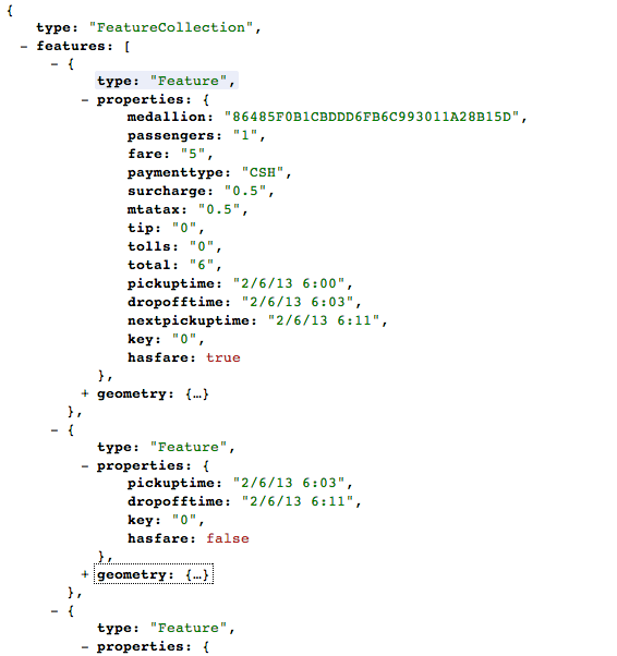
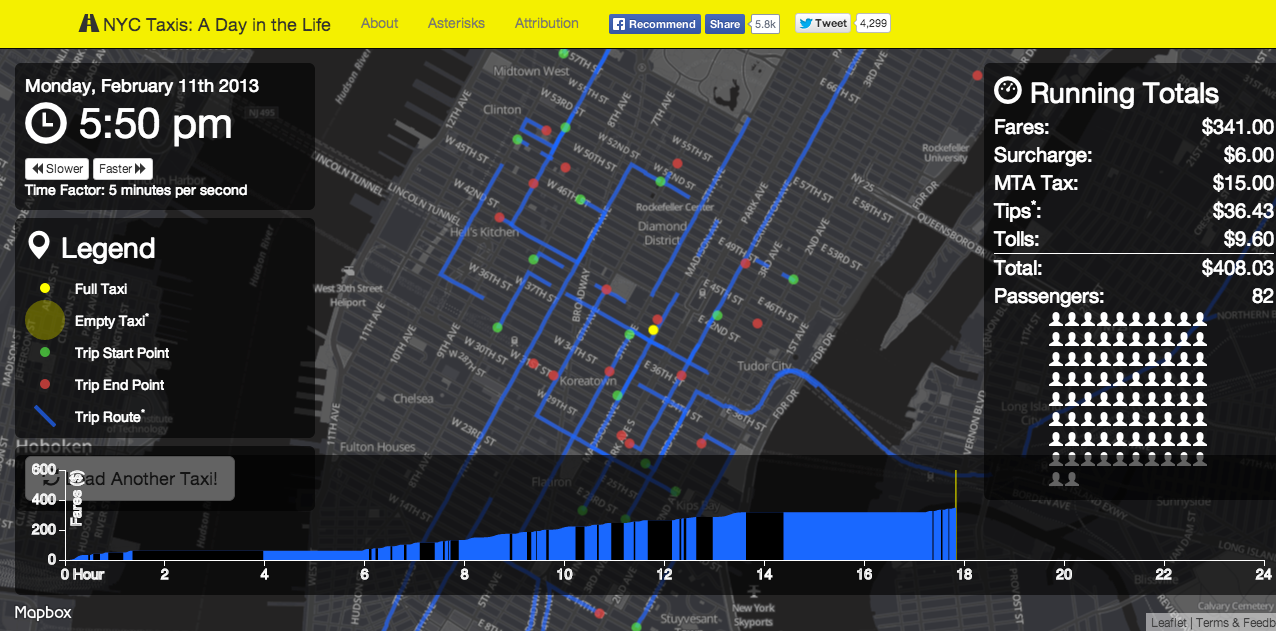
The FeatureCollection returned is sorted by start time, and includes alternating full and empty taxi trips. Our full taxi trip’s properties include all of the goodies about fare, taxes, surcharges, passengers, etc, and the empty trips have only a start and end time.
Putting Data on the Map with D3
Now we need to get all of these trip polylines onto the map. Mike Bostock’s D3 + Leaflet block is a great starting point for turning geoJSON into an SVG layer that’s intimately tied to leaflet. A couple of functions make sure that when you pan or zoom the leaflet map, the SVG overlay is updated accordingly. It’s a go-to reference for me whenever I set out to build web maps with D3.
Remember, the whole point of building the backend to serve up geoJSON in the first place was so I could easily bring it into D3 using the d3.json() function just like in the tutorial above. After setting up global variables, creating the map and SVG elements, and defining a few jquery listeners, I use d3.json() to hit the trip endpoint and draw all of the trip polylines on the map:
d3.json('/trip', function(data) {
 console.log("Loaded data for medallion: " + data.features[0].properties.medallion);
 var feature = g.selectAll("path")
 .data(data.features)
 .enter()
 .append("path")
 .attr("class", function(d) {
 if (d.properties.hasfare == true) {
 return "trip" + (d.properties.key * 2) + " " + d.properties.hasfare;
 } else {
 return "trip" + ((d.properties.key * 2) + 1) + " " + d.properties
 .hasfare;
 }
 })
 .attr("style", "opacity:0");
I set the opacity of each polyline to zero to make it invisible, and assign a unique class for the trip number (trip0,trip1,trip2, etc) and a class for whether it’s a paid trip or an empty trip. Before the user clicks “Begin” on the splash screen, the svg elements for each trip are already drawn on the map, you just can’t see them. The rest of this visualization will depend on making each one visible at the right time.
Animating a Marker and its Trail
Way back when this visualization was just an idea, I was faced with the challenge of making an animated marker leave a trail on the map. Every other part of this concept dataviz was within reach, technically speaking, but leaving a trail behind a marker was uncharted territory. After what seemed to be an absurdly small amount of googling, I stumbled upon the block that was the last piece of the puzzle, and got me started actually building this thing.
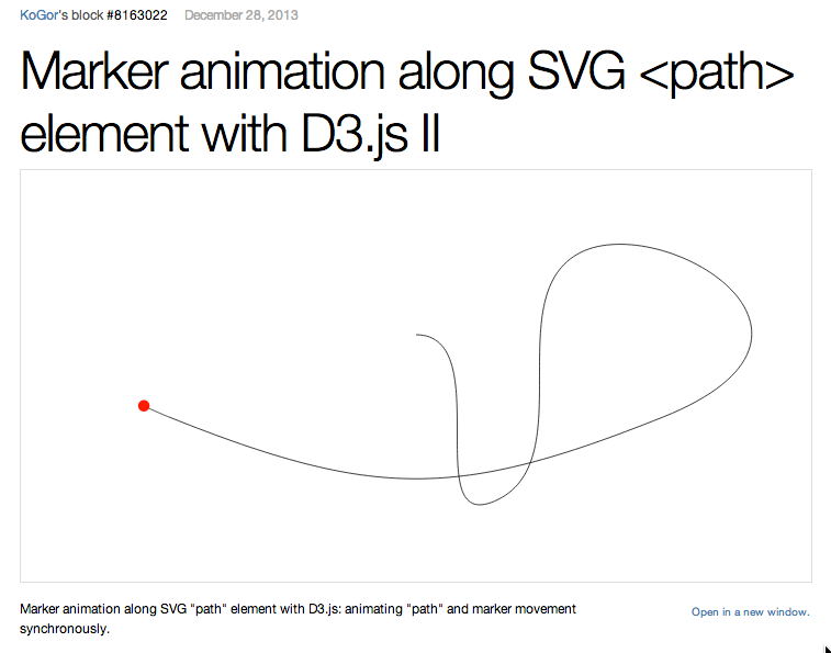
Do click the link above and watch the ball animate… it’s as beautiful and mesmerizing as any taxi trip. So what’s going on here? It’s an ingenious tweening of the stroke-dasharray SVG attribute. Tweening is a term for transitioning the shape/position/color/etc of SVG elements, and is very easy to implement in D3. stroke-dasharray simply applies a dash pattern to an svg path element. This method is brilliant, and simply tweens the solid part of the dash from 0 to the length of the line in pixels. The marker is animated separately using another bit of brilliance:
function tweenDash() {
    var l = path.node().getTotalLength();
    var i = d3.interpolateString("0," + l, l + "," + l); // interpolation of stroke-dasharray style attr
    return function(t) {
      var marker = d3.select("#marker");
      var p = path.node().getPointAtLength(t * l);
      marker.attr("transform", "translate(" + p.x + "," + p.y + ")");//move marker
      return i(t);
    }
  }
tweenDash() is called on every iteration of the tweening to return the appropriate stroke-dasharray value for a moment in time… it uses the getPointAtLength() function of the svg path to figure out where the marker should be at this iteration of the tweening, and updates its position accordingly!
Adapting this to multiple svg lines in succession was the next step, and this was accomplished simply by incrementing a counter. Start with i=0. My iterate function starts with the following line:
 var path = svg.select("path.trip" + i).attr("style", "opacity:.7").call(
      transition);
Which selects the appropriate path on the screen (zero through however many trips there are in the data), sets its opacity to .7 to make it visible, and then calls transition(). transition() figures out how long the tweening should be based on the start and end time of the current trip, and sets out animating the stroke-dasharray and marker location using the method described above.
To draw green and red circles on the map for the start end end point of each paid taxi trip, I’m actually drawing one circle at the start of every trip, full and empty alike (the end point of a full trip is the start point of the following empty trip. iterate() runs the following code once for every path on the map:
path.each(function(d) {
      //add the translation of the map's g element
      startPoint[0] = startPoint[0]; //+ topLeft[0];
      startPoint[1] = startPoint[1]; //+ topLeft[1];
      var newLatLon = coordToLatLon(startPoint);
      pointsArray.push([newLatLon.lng, newLatLon.lat, d.properties.hasfare]);
      points = g.selectAll(".point").data(pointsArray).enter().append(
        'circle').attr("r", 5).attr("class", function(d) {
        if (d[2]) {
          return "startPoint point";
        } else {
          return "endPoint point";
        }
      }).attr("transform", function(d) {
        return translatePoint(d);
      });
      if (d.properties.hasfare) { //transition marker to show full taxi
        marker.transition().duration(500).attr("r", 5).attr('style',
          'opacity:1');
      } else { //Transition marker to show empty taxi
        marker.transition().duration(500).attr("r", 40).attr('style',
          'opacity:.3');
      }
    });
If the 3rd element of the entering array in pointsArray exists, d.properties.hasfare is true, and the circle is classed startpoint. If it doesn’t have a fare, the circle is classed endpoint. Some CSS rules apply the colors.
The same logic for d.properties.hasfare is used to animate the yellow marker between a solid small circle for a full taxi and and large, translucent circle for an empty taxi (the intent here was to show visually that I’m less certain about where the cab is when it doesn’t have a fare).
Moving the Map
I originally had a stationary map with a yellow taxi marker moving all over the place on its own. The problem with this was that you had to be zoomed way out to include all of New York City to keep the marker in frame. If you zoomed in to take a closer look, the taxi marker would venture somewhere else and you’d have to manually drag the map to follow it.
Leaflet to the rescue! In my tweenDash() function, I use the same coordinates used to update the location of the yellow taxi marker to recenter the map using leaflet’s panTo() function!
var marker = d3.select("#marker");
        var p = path.node().getPointAtLength(t * l);
        marker.attr("transform", "translate(" + p.x + "," + p.y + ")"); //move marker
        if (tweenToggle == 0) {
          tweenToggle = 1;
          var newCenter = map.layerPointToLatLng(new L.Point(p.x, p.y));
          map.panTo(newCenter, 14);
Keeping Time
Normally I’ll increment a unix epoch timer for a time series data animation. The unix timestamp is simply the number of seconds that have elapsed since since midnight on January 1st 1970. The unix timestamp at the time of writing this sentence is 1407035514. My normal approach to time series animations is to throw the unix timestamp of my first data point into a variable, and then increment it by however much time I want to elapse during a “frame”. In the next frame, I grab any data points whose timestamps fall between the previous frame’s timestamp and the current one. This technique can be seen in action in my Philadelphia Bike Thefts animation.
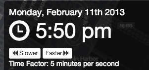
However, for the taxi animation, I have a contiguous chain of timed events. This is quite different from the bike theft data, where each data point is a single moment in time. In fact, I don’t really need a timer to keep track of the taxi data, since I can just “play” each trip in order from start to finish (this is what I did). I do include a timeFactor variable which is used when calculating all of the tweening… the user can easily increase or decrease this variable to speed up or slow down the animation. What I really needed was a way to display time to the user as the program makes its way through the day’s data.
moment.js is a javascript time library that makes it super easy to add, subtract, manipulate, and display dates and times in lots of formats. I used moment to quickly convert the time stamps in the data into readable text for display to the user. When iterating over each path, I show the start time:
time = moment(d.properties.pickuptime.toString());
        $('.readableTime').text(time.format('h:mm a'));
Next, I inelegantly increment the time by using a recursive function that just adds one minute to the displayed time based on the timeFactor:
function updateTimer() {
  time.add('minutes', 1);
  $('.readableTime').text(time.format('h:mm a'));
  $('.date').text(time.format('dddd, MMMM Do YYYY'));
  timer = setTimeout(function() {
    updateTimer()
  }, (1000 / timeFactor));
}
This approach is a bit unorthodox, as the displayed time is not actually linked to the tweening that’s happening on the path. This has the potential to be inaccurate over time, but at the start of each path’s iteration I clear the setTimeout and update the displayed time straight from the data again, so it sort of corrects itself.
Add some Metrics
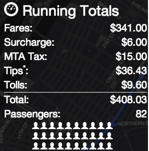
During the animation, I keep a running count of fares, taxes, surcharges, tips, tolls, and passengers. This is done by adding these values from each trip to running totals stored in an object:
var running = {
  "fare": 0,
  "surcharge": 0,
  "mtatax": 0,
  "tolls": 0,
  "tip": 0,
  "total": 0,
  "passengers": 0
};
As the end function for each tween, I update the running totals using the values for the current trip if it has a fare:
...
.attrTween("stroke-dasharray", tweenDash).each("end",
        function(d) {
          if (d.properties.hasfare) {
            running.fare += parseFloat(d.properties.fare);
            running.surcharge += parseFloat(d.properties.surcharge);
            running.mtatax += parseFloat(d.properties.mtatax);
            running.tip += parseFloat(d.properties.tip);
            running.tolls += parseFloat(d.properties.tolls);
            running.total += parseFloat(d.properties.total);
            running.passengers += parseFloat(d.properties.passengers);
            for (var p = 0; p < d.properties.passengers; p++) {
              $('.passengerGlyphs').append(
                '');
            }
            updateRunning();
The for loop in this snippet appends a little icon of a person on the screen to visually show the running passenger count. updateRunning() then updates the divs that show the running totals. It would have been rad to use angular.js here to take care of the data binding, but I didn’t get that far.
Animated Area Chart
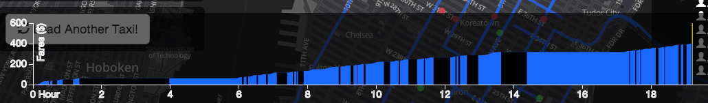
I’ll skip the technical breakdown of the animated chart, as that would be a blog post as long as this one already is. Suffice to say this chart was made with D3, and every “frame” of the tweening adds new data to the array that drives it (which is why the trips appear to be wavy).
The blue area is a single SVG path similar to this example. The “empty” trips are their own SVG paths. There are plenty of more efficient ways to implement something like this, but this one worked so I stuck with it.
I wanted to show the cumulative fares over the course of the day, and clearly show when the cab was empty vs when it was full. The user can glance at the chart and see where in the day there were large gaps in fares, or when there there long expensive trips versus several shorter ones.
It’s been pointed out to me that a column graph would also be helpful (either replacing the cumulative graph or complementing it) to better compare the individual fares.
Bootstrap
Twitter Bootstrap gets a very special mention… I’ve only recently started to use it in projects and it eliminates so much of the time I would have spent manually laying out DOM elements and styling everything. With just a little bit of custom styling you can give your bootstrap project a life of its own, while the heavy lifting is all done for you.
TODO
– I really want to make the chart and map interact with each other, so that you could hover over a specific trip on the chart and it would be highlighted on the map, and vice versa.
– I want to add shifts to each day, so what each driver is earning, not just how much the vehicle brings in.
– I want to add a metric for miles traveled (there are obvious limitations to this since we don’t know what happens between fares)
– I want to add a simple empty/full ratio and chart that would animate as well.
– I want to add a non-cumulative column chart (see above).
Hey, it’s open source… if anyone wants to implement any of the above and do a pull request, I’ll be happy to accept it!
As you can see, this project has a lot of moving parts, including databases, a node server, a geoJSON api endpoint, and big mix of javascript libraries tying everything together. I hope these techblogs have been helpful to anyone who wants to make animated dataviz in the browser. Thanks for reading!!!
Leave a Reply