Gothamist’s Best Maps of 2013… brought to you by Open Data

andrew

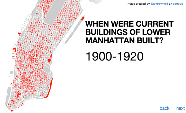
(image from Andrew Hill’s outstanding and Open Data-driven PLUTO tour, included in Gothamist’s top maps of 2013)

Gothamist recently published a recap of the 31 best interactive NYC Maps of 2013.  I immediately noticed the trend, and decided to look into the source of the data for each.  The results are below, with 22 (71%) of the maps using government data as their source.

Of those made with government data, 12 maps were made with Open Data, meaning it was published by the government as raw data, easily accessible and free to download and use.  That leaves 8 maps using government data that was not open data, either locked in PDFs, behind unofficial APIs, or accessible only via FOIL request.

9 of the maps used data that was either proprietary, user-collected and curated, or otherwise non-government data.  1 map (NYC Subway in the style of Super Mario World) was not data-driven (this is open to debate, comment away).

These numbers are a compelling case for Open Data… 71% of what Gothamist considers to be the best interactive maps of 2013 would not have been possible without access to government data.  These are prime examples of the amazing transformation of data as a raw material into useful and value-added finished products.

Many of these are created directly from NYC’s most popular open data set, 311 reports from 2010 to present.  This dataset is updated daily, and includes over 6 million rows indicating the pulse of many city issues, from rats and graffiti, to noise and trash complaints.  Restaurant inspections data shows up as well.  Just imagine what these mappers could do with the NYPD’s crime and crash data if it was freely available too.

Below is a table linking to each of the maps, with annotated sources.   Green = Open Government Data, Orange = Freely Available but not quite Open Government Data, Red = Hard to obtain Government Data

Gothamist’s Top NYC Interactive Maps of 2013

FOIL from MTA Interactive Map Shows Where Subway Suicides And Other Injuries Happen Most
Published PDF Interactive Map: Which Subway Station Is Most Likely To Trap You In An Elevator
NYPD Public Records Division Interactive Map: Where You’ll Get Busted For Peeing In NYC
NYC Open Data (311) Interactive Map: Where New Yorkers Complain About Rats Most
NYC Open Data (311) Interactive Map: What NYC Neighborhoods Have The Most Dog Poop Complaints?
NYC Open Data (Sanitation Tonnage) Interactive Map: Which NYC Neighborhoods Produce The Most Trash?
NYC Open Data (311) Interactive Map: What NYC Neighborhoods Have The Most Public Drinking Complaints?
NYC Open Data (311) / Flickr Interactive Map: Bad Graffiti Is In LES, Good Graffiti Is In Bushwick
NYC Open Data (Restaurant Inspections) Interactive NYC Eating Map Shows Where To Find Cuisine From Around The World
User Collected Map: Watch The Rise And Fall Of NYC’s Many Movie Theaters
NYC FOIL from NYC These 5 Neighborhoods Supply Over A Third Of NYC’s Prisoners
User Collected Walls & Pieces: Official Gothamist Map of Banksy’s NYC Work Since 2005
NYC DOF Property AssessmentRoll  Archives Interactive Map Shows Where You Can No Longer Afford To Live In NYC
User Collected Plus Census Map Shows Correlation Of Shootings And Low Income Neighborhoods
U.S. Census Map: NYC’s Commute Times Are Long, Long, Long
NYC Open Data (PLUTO) Awesome Digital Maps Created From NYC Tax Data
Unofficial Citibike API 5 Cool Ways To Visualize And Track The Citi Bike Experience
NYC Open Data (ACRIS) Brooklyn Gentrification: The Map
PDF from TSTC Maps: New York City Pedestrian Fatalities By Borough
MTA GTFS Map: Find Out How Long It Takes To Get Anywhere In The City Via Subway
ESRI Demographic Data See Manhattan’s Wealth Inequality Visualized In 3D Maps
NYC Open Data (Restaurant Inspections) Interactive Map: Here Are All The Starbucks, McDonald’s And Dunkin’ Donuts In NYC
NYC Open Data (Restaurant Inspections) Map: The East Village Has NYC’s Highest Cafe Density
Proprietary Map Says Men Like LIC, Women Like Brooklyn Heights
8-Bit Data NYC’s Subway Map Gets Super Mario’d
User Collected from Twitter API Map: The Multi-Lingual Tweets Of New York
User Collected from Craigslist Map Shows Where New Yorkers Have The Most Missed Connections
NYC Open Data (311) Map: NYers’ Favorite Things To Complain About In Summertime
User Collected from Twitter API Twitter Sentiment Map Claims Times Square Is Happiest Place In NYC
NYC Archival Data? (from 1910!) Map: Find Out What Manhattan’s Sewers Smelled Like In 1910
Proprietary New “Porn Map” Reveals What New Yorkers Are Searching For

Leave a Reply

Your email address will not be published. Required fields are marked *