Some Viz – Philly’s Stolen Bicycles
Click to View the Visualization
I dropped in on the fellow Code for America Brigade in Philadelphia last weekend, and they happened to be hosting a transit-themed hackathon. While I had missed the Friday night pitches and voting, on Saturday morning people still had a chance to promote certain datasets and let others know what they were planning to work on. Philly’s chief data officer, Mark Headd, mentioned that 3 years of bike theft data had recently been put on github, available in multiple formats, and he wanted to see someone put it to use. With only a saturday at my disposal, I figured that as spatio-temporal data, it might be a good candidate to map/animate in processing. I’ll outline the process here for those who are interested. For those who are not, you can just go check out the visualization.
I’ve lamented for a while about how the visualizations I make in processing are not interactive, and are fixed video products… they’re easy to share with viewers, but impossible to update with new data. I’ve been dabbling with D3 lately, and figured now was as good a time as any to get time series data into a web map that would support zooming, and panning, a customized basemap, and best of all, the ability to link it to an API so the data is always fresh (I didn’t quite get to this last bit, but all of the parts are there.)
I went digging for a tutorial to get me started and found this. It has all the parts I need: Leaflet calling custom tiles from cloudmade, conversion from lat/lon in a json file into LatLng for leaflet, and it updates D3’s svg elements when the user change the map view (by clicking or dragging).
First Thing’s First – Data Wrangling
To animate time series data, we need location (in the form of latitude and longitude coordinates) and time (as unix timestamps). The former was provided out of the box for this dataset, which is great, but the latter needs a little massaging. We have a THEFT_DATE column (x/xx/xx) and a THEFT_HOUR column (xx). First, this handy formula in excel will convert our date to a unix timestamp. 1/1/2010 becomes 1262304000 (midnight, since there was no time specified). We can multiply the THEFT_HOUR by the number of seconds in an hour (3600) and 20 (8pm) becomes 72000. Time zone could come into play if we were mixing datasets with unix timestamps. I added 5 hours to the THEFT_HOUR column, but this didn’t make a difference as we are animating one full day of thefts at a time, and quickly. Adding days to hours, we have a nice timestamp to use to grab the appropriate chunks of data for each iteration of the visualization.
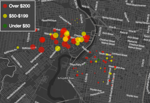
There’s a column in the data called UCR that has one of three codes about the dollar value of each theft. Using the README, I converted these to human-readable text, just in case I wanted to use it as a label. 625 becomes “$50-$199”.
Time to D3
The meat of this visualization is happening in the update() function, which draws a day’s worth of thefts on the map, increments a timer, and transitions thefts from the previous day off the map. You can find all of the code on github.
After importing our csv, we call update once, and it will continue to call itself over and over (letting this timer run forever is admittedly sloppy, but I was on a tight timeline and just had to get it working… there’s plenty of time for cleanup later)
By using a key value in .data()’s callback function, d3 will keep track of the circle elements it’s drawn by their unique id, adding and removing them appropriately. Without this, it would simply compare the number of elements in the data with the number of elements on the screen, and blindly remove a surplus from the end of the array.
function update() { previousTime = time; //keep track of the previous time before incrementing time = time + 86400; //increment by 24 hours //get thefts that fall between the previous time and the current time grab = collection.filter(function(d){ return (d.UnixResult < time)&&(d.UnixResult > previousTime); }); var feature = g.selectAll("circle") .data(grab,function(d){ return d.Key; //this key function tells d3 to actually keep track of which elements are entering and exiting, not just remove blindly from the end of the array }); //fade in a circle for new data feature.enter().append("circle").attr("fill",function(d){ if(d.UCR==615) return "red"; if(d.UCR==625) return "yellow"; if(d.UCR==635) return "green"; //change circle radius based on zoom level }).attr("r",0).transition().duration(100).attr("r",function(d){ return map.getZoom(); }); //fade out yesterday's circles feature.exit().transition().duration(250).attr("r",0).remove(); //update x and y position for each circle based on the map's viewport feature.attr("cx",function(d) { return map.latLngToLayerPoint(d.LatLng).x}); feature.attr("cy",function(d) { return map.latLngToLayerPoint(d.LatLng).y}); //repeat, every 100 milliseconds! setTimeout(update,100); } |
Display considerations
To make the visualization a bit more informative, I color coded the elements based on the value of the theft, using a simple Green-Amber-Red scale. By making the circles slightly transparent and using a dark basemap from Cloudmade, the patterns are more visible and the data jumps off the screen.
By adding a very fast radius transition in and a slow radius transition out, we can have thefts linger for a few days, drawing more attention to areas that have had recent activity.
I use this handy function for converting unix timestamps into human readable date, and replace the contents of the date div each frame:
function showDateTime(unixtime){ var newDate = new Date(); newDate.setTime(unixtime*1000); dateString = newDate.toString(); dateString = dateString.slice(0,16); document.getElementById("timestamp").innerHTML = dateString; } |
Some css to position the boxes, about text, links, and we’re in business. This took about 6 hours from conception to finished product, with lots of interruptions to go see what other people were working on and mingle.
Next Steps
- Trailing Graph – Making a line graph that extends itself with each frame is a nice touch, and allows the user to see the visual trend in number of thefts over a longer time range.
- Scrubber – This simple viz starts on the first day available in the data and runs forever. A scrubber slider would allow the user to move to a specific date to start the animation, or perhaps slow down the visualization, view by the hour or month, etc.
- Live Data – This viz will be out of date the moment the city of Philadelphia updates their dataset. Pulling the data at runtime means it will be current, but the wrangling done in excel will need to be done in javascript.
I’ll probably put these things into a future d3 time series animation that’s based on this one, but if you want to take a stab at them, fork this project and have at it!
Support Open Data!
Leave a Reply