← Blog archive

NYC · December 29, 2013

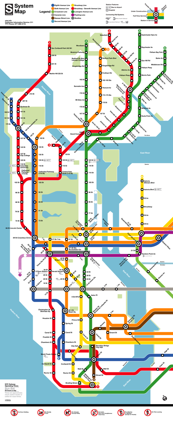
An NYC Subway Map in the Style of Washington, D.C.'s

Buy a printed poster of this map at brooklynstreetworks.com.
nycasdcfinal2000

Buy a printed poster of this map at brooklynstreetworks.com.

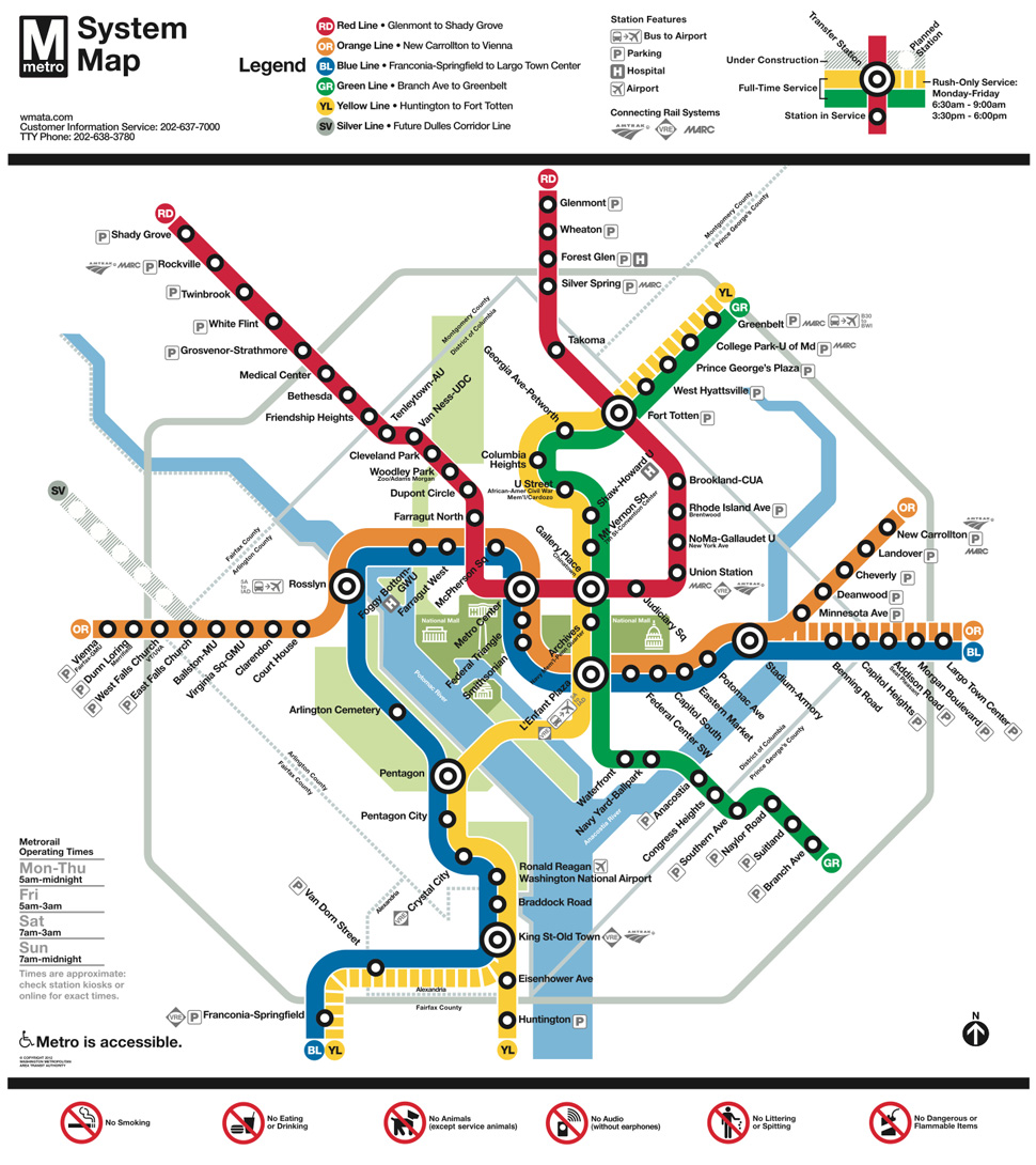
One of my prize possessions is an authentic 1991 Washington, D.C. Metrorail subway map.  6th grade me wrote a letter to someone at WMATA asking how I could get my hands on an actual subway map from one of the trains, not some reprint or collectible poster.  A response came (man, I wish I had saved it) informing me that a legit DC metro map could be had for $35, a lofty sum for a 6th grader in 1991.  I came up with the money, and the rest is history.

That map still adorns the walls of my little teeny NYC apartment, and one day last month it occurred to me that it might be interesting to draw transit maps using the design elements of other transit systems.  D.C.'s map is iconic in its simplicity.  Everything on the map runs in 90 or 45 degree angles.  There's actually very little on the map to distract the reader.  No attractions (except for icons of D.C.'s monuments), no street names, bridges, or landmarks.  Transfer stations are big bullseyes, regular stations are little bullseyes... that's about it, save for markings to transfer to other rail systems, legends, and other administrative necessities.

After several sittings over the past couple of weeks, it's finally done.  I've excluded Brooklyn and Queens, which dominate the NYC Subway Map, in order to keep the relative width the same as the original.  Like most transit maps, it's highly distorted, with Lower Manhattan as the center of attention.  One of the biggest challenges was fitting everything in with only 90 and 45-degree angles, which forces the dimensions of some spots (especially where broadway cuts diagonally through midtown).

This was a lot of fun to create!  I hope you enjoy it.

Tweet to @chris_whong and let me know what you think!

-Chris

P.S. I want to give a special thanks to Cameron Booth and his great tumblr blog on transit maps.  He has a great post on the technicalities of nesting rounded corners, which I found quite helpful in making this map.

Edit 2 - I actually remember the name of the person who I exchanged letters with at WMATA when I was 10 years old. His name was Eugene Sansone, and from some googling it looks like he's a transportation professor at NYU poly now... does anyone know him?
washington-dc-metro-map (1)

Buy a printed poster of this map at brooklynstreetworks.com.

This post was migrated from my old WordPress blog. Embedded maps and links to third-party sites may no longer work.

Comments (archived, closed)

  1. SM ·

    Could I pay $35 for this map? Wonderful!

  2. Chris ·

    Yes. Soon. Plus Inflation.

  3. G. Oshel ·

    Having this map available as a poster would be very cool!

  4. AJ ·

    Very cool - thanks for making it!

    I did notice, though, that the 49th St/7th Ave Station on the N/R trains is missing...is this on purpose?

    1. Chris ·

      No, not on purpose. This is one of many errors/omissions that I'll get around to fixing at some point. The internet has called me out on a few.

  5. Allan ·

    Gene Sansone as he is known today spent at least 30 years of his career in the Car Equipment Department of NYCT of the MTA. He has written at least one book which you can find in bookstores about NYC Subway cars. He retired a few years ago. I used to work for him.

  6. S ·

    Love the design! Very clear. Sadly, completely useless for the 5 million of us who live in Brooklyn and Queens. Is there any way to do this map while including the entire subway system?

    1. Chris ·

      Hi there,

      Usefulness to New Yorkers was never the intent of drawing a map using DC-style features. It's a design exercise, meant to show the benefits and/or limitations of the DC design elements on another system. It was also fun to make, nostalgic, and interesting to see what's there and what's not. There have been lots of people asking if I can expand it, and I probably will soon, but I don't intend for it to have actual utility for straphangers. There's no way to depict express trains and "long-tunnel transfers" and to stay completely true to DC METRO design elements.

  7. Jody Fisher ·

    I like this a lot! Someone send it to City Hall and the new mayor.

  8. Darrell ·

    As one who is new to NYC I have often chosen to just stay home because I can't figure out the subway map. Please ...... how can I get this?

  9. Allan ·

    Have you ever seen the NYC subway maps from the 1930s through 1950s? The DC style very similar in style to what we had back then. The only difference was that colts were chosen by division or company, IRT, BMT, or IND, instead of by trunk line. I'm sure you can find examples on NYCsubway.org.

    They also used thin lines for parts of the system that were completely elevated, because they wanted to emphasize the subways and de-emphasize the Els. That part I never liked, especially when Els that were part of the subway we're drawn as if they were subways. Over time the thin lines all but disappeared. In 1959, those maps were dropped in favor of a more "modern" style. But that only lasted until they decided to show the routes.

    I wouldn't be surprised if Wash DC got the inspiration for their map from our old ones.

  10. Walter Daum ·

    Great idea, very clear. To be useful, it would have to show express stations in some way, maybe a square symbol instead of the circle. Then the problem arises of stations like Columbus Circle that are express on one line and local on another. But that should be solvable, and if it adds a bit more clutter, the overall reduction of clutter would still be huge. There are still distinctions to be made between 3-track and 4-track express stations, and other part-time usages. So it would need a line-by-line explanation alongside. Still, great idea.

    1. Chris ·

      I think all that's necessary to clearly depict NYC's service is the following:

      -Written labels showing which trains stop at which stations... perhaps just as subtitle. In this rendition, there is plenty of white space, since station names are so short.

      -Ability to depict local vs. express stops graphically. (A new symbol for express stops, I'd keep local stops using the traditional DC stop indicator)

      -Some ability to show transfers that are not really near each other You can transfer from the 1-2-3 to the L but you have to walk a full Avenue underground.

  11. Thomas ·

    Beautiful! Now...show some love for Brooklyn and Queens!

  12. Gregory V. Bard ·

    Because the consumer price index was 136.2 in 1991 (the all-year average), we can say that in November of 2013 (the most recent month for which data is available), when the CPI is 233.069, that the equivalent sum of your $35 purchase would be

    (233.069)(35) / (136.2) = $59.89...

    Yes, that's a lot for a subway map!

  13. Eric ·

    Very nicely done!

  14. Sean Robertson ·

    Wish it included Brooklyn and Queens, but otherwise nicely done. Lance Wyman designed the DC Metro map, but Massimo Vignelli designed the signage for that system and his famous 1972 NYC map likely inspired it.