A D3 Bubble Budget Visualization for NYC
You can check out this visualization at http://www.chriswhong.com/projects/nycbudget
I remember being blown away the first time I saw Shan Carter’s awesome interactive bubble visualization of Obama’s proposed 2013 budget. It was the dataviz gift that kept on giving, allowing four different ways to arrange the bubbles, each showing a different aspect of the budget.
A couple months ago, just for the hell of it, I downloaded a copy of the NYC modified budget in PDF format. I was more interested in the information about government structure (It turns out budgets are a great reflection of government structure and hierarchy… useful for govSee and similar projects) but when looking at the top-level summary page, I immediately thought of the bubble visualization mentioned above. I’ve used d3 before, so it shouldn’t be too hard, right? After some quick googling, I was thrilled to learn that Jim Vallandingham had created an amazing tutorial using coffeescript to do the exact same kind of bubble diagram! I brought the link to a BetaNYC hack night and had a semi-working demo up in about half an hour.
Someone who saw us manually transcribing agency names and dollar amounts from a PDF reminded us that just a few weeks prior, NYC’s comptroller had launched CheckbookNYC. Checkbook NYC had all of the same data on the web (and a LOT more… it was also recently released as open source for other municipalities to use. Open Source/Open Data FTW!). I decided it would be really cool to show revenue categories alongside agency budgets to really show the whole picture.
The only tweaking necessary in excel was creating a formatted version of an agency’s dollar amount for display in the info window, and a “raw” version that was simply an integer that would be used to calculate the size of the bubble.
For expenditures, there is another attribute, percent change. This is simply an integer and is used to calculate the color of the bubble and shows up in the info window.
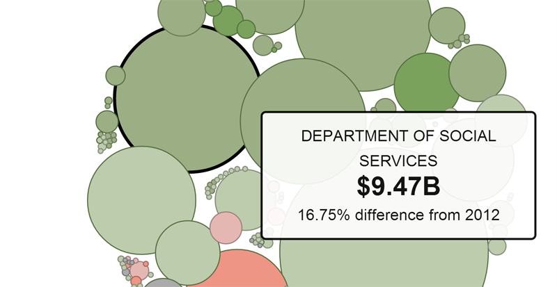
It’s quite fun to explore the bubbles and really see how much more it takes to run a school system than a community board. The ambiguous category of “Taxes” makes up the majority of NYC’s income as we might expect, but I want to drill down further and see the breakdown of property taxes, income tax and sales tax. Unfortunately, checkbook NYC is not so great at this sub-tabulation and we’re left to sort through thousands of rows with repetitious/ambiguous names. That’s a project for another day.
It might also be neat to add sub-bubble graphs for an agency to drill down their expenditures. If you’re up to the task, my code is on Github.
Leave a Reply