Gothamist’s Best Maps of 2013… brought to you by Open Data
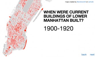
(image from Andrew Hill’s outstanding and Open Data-driven PLUTO tour, included in Gothamist’s top maps of 2013) Gothamist recently published a recap …

(image from Andrew Hill’s outstanding and Open Data-driven PLUTO tour, included in Gothamist’s top maps of 2013) Gothamist recently published a recap …
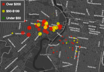
Click to View the Visualization I dropped in on the fellow Code for America Brigade in Philadelphia last weekend, and they happened …

You can check out this visualization at http://www.chriswhong.com/projects/nycbudget I remember being blown away the first time I saw Shan Carter’s awesome interactive …
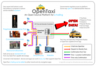
I remember the day Uber came to town last fall. NYU’s Wagner School of Public Service has its home in the Puck …
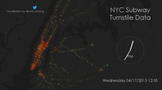
Here’s the Vimeo version. I set out several months ago to visualize the MTA’s turnstile dataset. It’s updated weekly and resides here. …
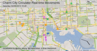
Betamore hosted a transportation hackathon in Baltimore this weekend by the name of Reinvent Transit. Like any good displaced Baltimorean who is …
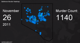
This video shows a heatmap animation of homicides in Baltimore City from January 2007 through September 2012. Each incident adds heat which …
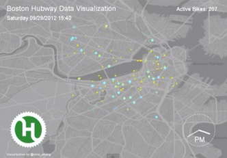
10,467 trips are shown, on a Wednesday through Sunday time period in late September 2012. Blue dots represent “starts”, where a person …
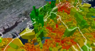
3D Animation showing extruded median income in New York City. Made with ArcGIS. Data: American Community Survey 2008-2011 3 year estimates.
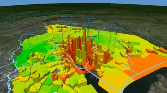
Made with ArcScene and U.S. Census Data. Density is represented by elevation, Median Income is represented by color (red = lowest and …