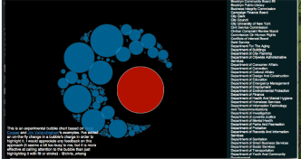
An Experimental Twist on the D3 Bubble Chart
Recently I was playing with charting some data that has a very large range of values, and some outliers with REALLY large values relative …

Recently I was playing with charting some data that has a very large range of values, and some outliers with REALLY large values relative …

It’s my very first “thing”. I’m fairly new to 3D printing, and have had my build-it-yourself printrbot for a couple of months… …
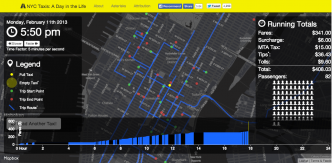
This is part 2 of my techblog about NYC Taxis: A Day in the Life. In part 1, I showed how I …

A week ago, I published NYC Taxis: A Day in the Life and it went a little bit viral. This seems to …

Update 6/16/2014: Many people have asked for this data since I published this post, and like a non -forward-thinking government, I’ve come …

He or she is in there… I promise! The technology landscape has evolved into a perfect storm open source tools and code, …
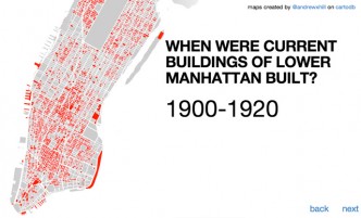
(image from Andrew Hill’s outstanding and Open Data-driven PLUTO tour, included in Gothamist’s top maps of 2013) Gothamist recently published a recap …
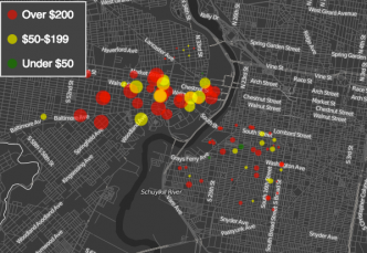
Click to View the Visualization I dropped in on the fellow Code for America Brigade in Philadelphia last weekend, and they happened …

You can check out this visualization at http://www.chriswhong.com/projects/nycbudget I remember being blown away the first time I saw Shan Carter’s awesome interactive …
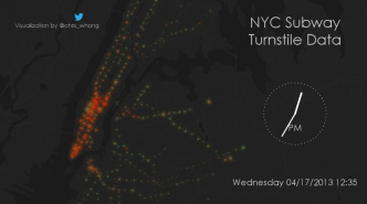
Here’s the Vimeo version. I set out several months ago to visualize the MTA’s turnstile dataset. It’s updated weekly and resides here. …